Wednesday, 17 September 2014

Exercise: Symbols

For this exercise, i had to find more than one symbol for the following subjects, and suggest how i might use them in a photograph.
The subjects are as follows;

Growth

The process of increasing in size.
Something that in grown or is growing.

Symbols may include a plant, perhaps a young seedling. This is the first thing that comes to mind for me when thinking of growth.
A child could also be used as a symbol. This could be photographed with a child measuring themselves on a heigh chart.

Excess

An amount of something which is more what is necessary, permitted or desirable. 
A lack of moderation, especially in eating or drinking.

When i think over excess, i think of overindulgence, such as a large roman feast.
Symbols of this could be a photograph of a large amount of food, a feast.
An over weight person, perhaps holding or bearing their stomach

Crime

An action or omission which constitutes an offence and is punishable by law

Symbols for this could be handcuffs, a police officer, a finger print perhaps.
If i had to take a photograph for this symbol, an idea would be taking a close up of a persons hands in handcuffs, as if being arrested.

Silience

Complete absence of sound.

A symbol for his could be somebody with their mouth taped/zipped/covered up with an object or a hand. An empty rural scene. Perhaps containing a lone person. Or a visible place within the scene where a person could be eg. an empty bench, an empty still rowing boat on a lake etc. Maybe even a picture of a pin dropping.
If i was to take a photograph for this, i would take a portrait of a person with their hand over their mouth.

Poverty

The state of being extremely poor

When i think of poverty, i think of the malnourished children in Africa living in complete poverty. Perhaps due to the high levels of advertisement and charities we see on the television each day.
Unfortunately living in England, the children living in poverty in a different country are difficult to photograph.
Other symbols and possible photographs I could take are of homeless people in this country, sitting on the side of the road. Orphans, food bank, ragged clothing, hands holding an empty bowl or cupped together as if asking for an offering.

Exercise: Evidence of Action

For this exercise, i had to take a photograph showing something that had happened, evidence of an action. For this i chose a broken flower pot which i had dropped on the floor.
I took photographs from various different angles trying to capture as much of the splatter as possible. In my head i already knew which angle i wanted to use; a low shot looking across the length of the mess but shot a variety just incase i found something i preferred the outcome of.
I tried the capture as many fragments of the pot as i could with plenty of dirt among it, so it wouldn't just look like a pile of rubble or fragment of pottery and so would be obvious to the viewer what had happened.
Here is my photograph:

Sunday, 14 September 2014

Research: Per Bak Jensen


Per Bak Jensen is a landscape photographer from denmark. His photographs often connote a sense of emptiness, isolation this may be created by the mist captured in most of this photographs, or the level of lighting, quite dull often grey or blueish.

Tree is a misty forest. I love how in this photograph, the background is very soft, slightly blurred perhaps because of of the mist . I love how this allows you to look at the photograph as colours and patterns as opposed to what the objects actually are.
What i can only assume to be a large puddle in the middle of a flooded field. There is no reflection in the water, it is simply a white strip, due to the lighting conditions. I love how the top 50% of this picture is pure mist. Grey. You cannot see through it. And the bottom 50% green. Both dull colours. I love how there is also a smooth transition between the two across the centre of the photograph.
A lone rock in the sea. I love how this image is a lot sharper and bolder than the other two due to the lack of mist in front of the rock. But still it seems to connote the same emotions.
Apart from the shadow in front of the rock the sea is very much one colour. It doesn't shine, it doesn't move. Its very flat and matte, almost like paper. I love how the shadow does create a bit of texture though. You can see, just about, where the light hits either side of the front of the rock, and the slight ripple in the water. just in this small space. Giving a great sense of depth in an otherwise flat sea. The sky very much the same colour as the sea broken up by the horizon line. A very straight line a slightly darker shade of grey than the sky and the sea. The dullness of the background really makes the black glossy rock stand out.


Research: Galen Rowell

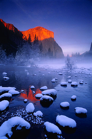
Galen Rowell was an american landscape photographer who's work i absolutely adore due to the colours he manages to use and capture that almost look unnatural, but so beautiful.

A snowy lake scene. I love how the use of contrasting colours here.  The sun hitting the mountain in the background creating a gorgeous bright orange which can also be seen reflected in the water. Against the strong blue of the sky and the water.
I love how the mountains in the foreground are quite dark but in the background, the most amazing gold mountains can be seen peeking out. almost glowing. Brightly outlining the dark mountains in front of them. I love how even further in the foreground, the back is a very bright mix of colours; blue, yellow, white and green. The dark mountain sandwiched between brightness. The grass growing out the water at the front of the frame is noticeably green, almost looks like a green shadow rippling in the water for the silhouetted mountains. You almost have to look twice.
Again the colours here are absolutely phenomenal. The contrast between the orange and the blues again. The photograph is so crisp, and the water so still that the reflection of the mountain in the water almost doesn't look like a reflection, but a continuation of the mouton itself.

Exercise: A Narrative Picture Essay

For this exercise, i had to tell a story using photographs. I decided to use the method of baking a cake as my story.
I love to bake and so this was very familiar to me and so i could focus more on taking the photographs than the process of baking a cake itself. I am familiar with a lot of cook books, and how pictures are represented in these. I was already aware of what i personally find visually attractive in a cook book and had a basic idea of how i would set one out if creating one myself.
To tell my story, i took a photograph of each step i took creating a cake, starting with the ingredients and ending with the finished product. Some photographs i took out as i felt they were not important or visually just didn't look that great. I wanted the steps to be obvious, but i didn't want too many pictures so it was overwhelming. I wanted some simple, crisp, easy to understand and quite modern looking.
I kept my photographs in chronological order, to show method and to be easily understandable to the reader, so much so that very little text would be necessary to understand how to make the cake.
To get it looking very neat and simple, i tried to keep my photographs together in  neat, very clear square formation. I tried to keep all the photographs the same size, as no step is more important than the other, and to be the simplicity of this visually pleasing. I made the one photograph, of the egg shells, bigger than the rest. I did this just to break it up a bit, and to me it makes it look just that bit better. I chose this photograph over the others, as i found it more attractive, and more abstract. I feel it works well. It also breaks up the colour in what would other wise be a collection of very beige photographs. 
My vision for this in print would be; these photographs on one page, and on the adjacent page, the recipe. Very simple, very neat, very crisp, very easy to understand and hopefully very visually pleasing.
From left to right
1. Ingredients
2. Creaming the butter
3. Creamed butter mixed with sugar
4. Empty egg shells
5. Cake batter
6. Batter ready for the oven
7. Whipping cream for the filling
8. The finished product.

Saturday, 2 August 2014

Research: Adam Elmakias

Perhaps a more mainstream photographer, Adam Elmakias is a music photographer , perhaps one of my favourites. Who travels the world taking photographs of different bands.
I love how emotive his photographs are, and how they capture the energy of the concert perfectly.

The enjoyment of the crowd captured under falling confetti. I love how dark the crowd are here, you can barely make people out, just the shape of arms rehang out. Against a very white, well lit stage in the background.

An action shot of the drummer capturing the crowd in the background really shows the energy here.
I love how the band are silhouetted here.

A crowd captured under a hazy mist of lights. I like how you cannot see what the crowd are watching due to the lights, but you can feel the energy and see they are having an amazing time. I love how crisp the crowd are here, even though they are so dark.

Probably one of my favourite photographs. The true energy of a rock festival. This is image is so sharp and perfectly timed. I love how the background; the sky, crowd and tents in the background are all very light/ white almost all the same shade whilst the shage and the musicians are quite dark, a lot more black present. This keeps your attention in the foreground and really makes the musician stand out. Almost as if they are jumping out of the photograph.

Confetti falling, all which looks quite sharp, which i love, captures the engery present at this concert. It certainly makes me think ' i was i could have been there' .

Adam is beginning to use drones in his photography now and the outcomes are amazing. This photograph would not be possible without one, it adds a whole new dimension to music photography. I absolutely adore this photograph and the emotion it portrays. A lone musician with a guitar. I can only assume singing a ballad. The lights from this angle create a heart which his shadows fill. The different angle from which the lights hit almost make the shadows look like two different people, as they are not identical. The rest of the stage is almost in complete darkness which helps create the beautiful effect.

I love the burst of light exploding from behind the musician here, and the glow it creates. Its not your average photograph of a musician, but it makes him seem somewhat more human, on an emotional level that you do not usually see.

Saturday, 19 July 2014

Feedback: Assignment 4

Tutor Reports Assignment 4

Overall Comments

The orange has all the qualities needed to satisfy the four categories: Colour, texture, form and shape. As such it is a good choice for a subject. It has such a simple shape it needs some creativity to make the most of it. You have shown concern for your lack of professional lighting, yet this isn’t necessary for this assignment, in fact it is the variety of different lighting sources that can offer the creativity required. 

How many photography competitions are won with shots taken with daylight, or under ambient artificial lights, at dusk or at night? Each of these show that a lack of studio lights does not limit creativity. A longer exposure is required for weaker, household lights – requiring a firm surface (or a tripod) to place the camera on, plus the use of the camera’s self-timer, or a cable release. 

There are many sources that can add an extra area of light in the frame, such as torches, or a steady warm glow, such as candles, or a series of dim lights around a subject (led lights or xmas lights). The longer exposures required indoors can allow a moving light to be used during the time of the exposure, showing a trace of light or simply highlighting a specific area.

Another source of variety is the background. Careful use of light and shade, or selective focusing, can limit what is seen of the background, or accentuate it. I’ll comment on use of this in my feedback below. Placing objects (possibly transparent ones) between light source and subject will create shadows as well as light on the image area – see examples using slatted blinds, glass blocks, glass bowls or jugs, water in glass etc. Each of these makes the image more interesting just by altering the quality of the light.


Feedback on assignment 

Your notes show that you have experimented with various options of diffusers and reflectors as well as camera and lighting angles. There is a range of scale in these shots of the orange, which adds some variety. I would have liked to see more experimentation with backgrounds and possibly with props, e.g. cutting the orange into segments and shooting on a chopping board (with a knife, or with other oranges), or perhaps with the paper or plastic that oranges are packed in, or an orange crate? 

You have demonstrated that you understand each of the categories and that you recognize how your lighting affects these qualities. The form images show two methods of revealing the orange’s three-dimensional quality. The first shot could be cropped so that the top half remains, then the cloth would only be seen out of focus and the resultant curve would be a strong design element. The second shot needed a more careful use of background material so as not to detract from the subject.

Use of coloured backgrounds to contrast with the orange show an appreciation of the power of these effects (as in assignment 3). I also find the placing of the subject in the frame to be well executed in many shots, e.g. the final image where the green area is on the ‘thirds’.

The shape images show the orange as round, yet any shot would do that as long as the background was even. Lighting from behind would accentuate the outline, either lighting the background or shooting against the light showing rim lighting. You mention making the orange bright in colour for the first shot, yet also say you underexposed it – these contradict each other. Under-exposure won’t make lighting subtle or smooth as it only affects how light or dark it is. It is the contrast formed by variations of exposure – by size, distance and position of lighting, that creates contrast. I like the background in the first shot as it blends seamlessly from top to bottom. The choice of colour also contrasts well with the orange, without competing with its colour. 

The colour shots are always going to show strong colour with this subject! The first is an interesting close-up that makes the eye concentrate on the imperfections of the skin, noticing the brown colours as well as the orange. With direct lighting across the surface this could have made a great ‘texture’ shot. The second colour shot is similar to the very first image, but colours appear more saturated due to the harsher lighting.

Both texture shots have a colour balance that is far more green/cyan than the other images. It should still be possible to correct this in post-production software (e.g. with Elements or Gimp). The second shot has a good composition and is close enough to reveal much of the texture. It would be good to see the first ‘texture’ image shot similarly closely.


Learning Logs or Blogs

Don't forget to update your log with any activities, plans and thoughts about your work. Add also your research and thoughts on other photographer's work that you've read about or seen online or in exhibitions. In particular, relate your reflection and developing thoughts about what you see to your own work


Suggested reading/viewing

I recommend reading 'Dialogue with Photography' by Paul Hill & Thomas Cooper – interviews with photographers to see what goes on behind the camera. I also suggest that you look at the creative use of light and shade in the work of Brian Griffin and Fernand Fonssagrives.


Pointers for the next assignment

Assignment 5 draws on the skills you have developed during the previous four assignments: Using light, composition, concepts and colour. The assignment is a sequence of images that produce a narrative, telling a story in pictures. Your captions for these pictures provide further information, adding to the development of the story’s context. The style to be used for images and text is similar to what you might expect to find in a magazine.


The initial ‘cover’ image should be simple and striking; grabbing attention, persuading the viewer to look further into the sequence. It is good to have some variety of lighting, perspectives, camera height, scale etc. as these vary the pace of the sequence, helping to sustain the viewer’s interest in the story. What you leave in the final edit is just as important as what you cut out. This is a story best told directly, without any 'filler' images.