Saturday, 20 September 2014

Reflection Upon Assignment 5

Demonstration of technical and visual skills- Materials, techniques, observational skills, visual awareness, design and compositional skills
For this assignment, I have been using skills i have not previously on this course. Using photography to create illustration and narrative. I would like to think i have began to use these skills well. Every photograph i have taken i have taken with the outcome in mind, the narrative. How well each photograph helps to tell a story and whether it would be easily interpreted by the viewer/ general public. For this i would think i have been quite visually aware and relied highly on observational skills.
I have perhaps at times been to wary of this, and kept it maybe on the safer side of things.

Quality of outcome - Content, application of knowledge, presentation of work in a coherent manner, discernment, conceptualisation of thoughts, communication of ideas
I have done my best to explain each photograph and why i have taken it or placed it where ever. I have tried to add additional comments to my photographs to reiterate what the narrative is and explain slightly in more detail and my reasonings. I would like to think my thoughts have flown well onto paper and have been expressed coherently.
Id like to think my photographs are fitting for the subject matter at hand an that they are of a decent standard. As i have previously stated i have done everything with the subject/ outcome in mind and i hope that has shown.
I could perhaps have thought a bit more out of the box and used symbolism as talked about in the course material more to express actions as opposed to more obvious or literal photographs.

Demonstration of creativity - Imagination, experimentation,invention, development of a personal voice
I would like to think i have been quite imaginative as i thought in terms of magazine publication when shootings, imagining how it would look, and what i would want it and my photographs each to look like. Some of my photographs could have been more creative perhaps. I have tried to include a variety of different photographs and techniques. I'm beginning to see a style within the photographs i take now, and think i am beginning to find my personal voice in photography. I now need to hone in on that, and begin to improve and perfect it.

Content- reflection, research, critical thinking

I have made a conscious effort to do more research within this assignment time frame. I have done a lot more than i have previously, but it is something i need to continuously be aware of and could still do more.
I have tried to reflect and evaluate everything i have done as i am going along. I have tried to be quite clear and logical in doing so and would like to think this has shown within my work.


Looking back at the first assignment/ exercises i did for this module, i feel i have come along way. To begin with, my lighting was not that great, and it is something i feel i have improved on greatly and am rather happy with now. Some times my tutor may say things look a little under exposed, and sometimes they are. But i quite like a dark, bold appearance to some of my photographs, and it is done intentionally, i suppose it is my style, and not something everybody will appreciate. I have also toned down my editing of photographs a lot. Looking back, some of my photographs were way over edited, almost to the point of embarrassment. Im not sure if this is due to improvement within my work, or due to purchasing a better quality laptop, where these visual issues become a lot more apparent, that weren't on my old laptop. Whatever the reason, i only edit where i feel necessary. and then compare to the original copy to see if i prefer the edited state or not.
But i am comfortable with where i am / where i am going so far. I have enjoyed exploring the more artistic styles of photography, and the simplicity of some , and it is something i hope to do more of, and when starting this course, it is something i perhaps would not have thought of.
My ideas of photography and what i want to be doing within photography, have not changed. I still enjoy photography for the same reasons and i still have mindset and likes and dislikes within the topic. I still want the same things out of this. I would say i have simply expanded my ideas. As my knowledge has grown, so have my ideas and the paths that i want to be on. 
It has definitely made me more confident within my photography, looking back and seeing how i have improved, and having absorbed the knowledge in which i have.

Assignment 5 Applying the Techniques of Illustration and Narrative

For this assignment i had to create a series of pictures for a magazine, illustrating ad narrating a story.
The subject i decided to narrate, was of a day trip to Liverpool docks.
For my front cover photograph, i wanted something that was bright colourful, was obvious of the location/ subject and eye catching.

When you think of being by the sea, or along the riverside you think of sunshine and enjoying ice cream. on a leisurely stroll perhaps.
So i chose a photograph of a vintage ice cream van. The vintage van looks nice set in front of a dockside of old buildings. The reds in the buidlings and the reds in the van make it pop.
The van also says liverpool on it, telling of the location.
The main aspects of the setting and the story can be taken from this photograph which is why i would put it on the front cover.

The photographs going inside the magazine will be set in chronological order to tell the story of events. But can be split into groups of time/ place. Each group of pictures should remain on the same page/ spread of pages but can be separated from other groups by page/text/advertisement.

A very grey, foggy start to the day in Worcester. An early morning train journey to Liverpool. Here's hoping the weather gets better.

We arrived at Liverpool to a beautiful day.
We made our way to the docks and took in the views
Cut away picture of a seagull on a street lamp
A city bike ride perhaps?


We took in some of the dockside attractions/ landmarks as the sun began to come out
Outside the Liverpool Port building

Super lamb bananas along the water

Telescope
We then went for a romantic leisurely stroll along the water enjoying the sunshine

Many people had attached locks to the fence along the water

Many as friends, many as lovers.
We decided to add our own and be a part of it.

We then headed back towards the town

But not before enjoying an ice cream or two
A quick spot of shopping along the high street before we had to catch our train home

Train tickets from our journey of the day.

Exercise: Rain

For this exercise, i had to produce a single strong image representing rain, that could be used for a magazine cover that would leave people in no doubt of the subject.
I began to think f things that come to mind when thinking of rain; wellies, umbrellas, cold, wet etc and began to think how i could use these in photographs;
A picture of  pair of wellies. 
An umbrella propped against a wall.
An umbrella in use. 
A soaking wet person in the rain.
Rain hitting the ground.
Rain drops.
A puddle.

I took a few photographs containing some of the above. We haven't really had much rain recently unfortunately, so i had to improvise slightly pouring water over things. Or just using the symbols on there own with the use of water as they are strong enough on their own.
I tried to keep it quite simple. If its going on the cover of a magazine, it doesn't want to be too busy or overbearing if there is going to be text on the cover also.
Simplistic pictures can look visually stunning on there own, but also won't get lost or look messy if covered partly by text.

In the end i settled for this photograph.
This photograph is of rain drops on a leaf. You are in no doubt that this photograph is of rain due to the water and it being on a plant. I like how this photograph although obviously rain has a slight abstract feel to it. I adjusted the colour of the green slightly, the make the rain drops stand out slightly more and to make it look slightly more visually appealing.

Exercise: Juxtaposition

For this exercise i had to create a photograph for the front cover of a book of choice using symbols or juxtaposition.
I chose the book 'Revelator: The Neuromancer' by William Control.
The blurb reads 'Through the madness i shuffle. A wretched shell of the man i was when her love possessed me. Lucifer has given me one change of redemption. I am compelled to drag myself to the dusty finish line. Compelled by the love i have somewhere in my drowning heart and the curiosity of a new adventure that will one day surely kill me.'
The book is essentially filled with death and sex.
I wanted my photograph to obviously represent this but not give too much away.
Before i had decided what i was going to photograph, i had already decided i wanted the photograph to be quite dark, in terms of lighting. And to be in black and white. As i felt this would be quite fitting for the book and for the author.
The book has quite a niche audience, and so i wanted my photograph to be fitting to that. It doesn't have to be something that everybody will like or be drawn to but will appeal to the necessary audience.
I felt it was important i used a bed in my photograph to represent the sexual activity and nature in the book.
I also wanted a weapon to represent the death/murder aspect of the book. Obviously getting hold of a weapon is a slight problem. So i used a kitchen knife. The kitchen knife may also carry connotation relating to fetish. Again going back to the sexual aspect of the book.
I then threw in some under wear just to make it look more intriguing and as if something may have happened.


I took a few photographs as i wasn't really sure on which composition would look best. I used different levels of zoom, and different amounts/ items of clothing to see what look best. I tried to mess up the bed a bit to make it look as if it had been used
Essentially, i think the last picture is my favourite, and is what i would use for my front cover.

Wednesday, 17 September 2014

Research: Fernand Fonssagrive

Fernand Fonssagrives was a french photographer known for his 'beauty photography' often photographing his wife.
I love how here the human body is almost invisible. It is not the subject of this photograph, but instead part of the background. and it blends very well. The body is naked and curled up into a ball. An angle perhaps unusual and not normally deemed attractive. But since this is not the subject this is perhaps unimportant.
The subject is the shadow formed from a metal fence. that is projected over the naked body. The shadow a very strong, deep , bold black I love the shapes and his use of the body as a canvas.
Again, a naked body used as a canvas for a shadow cast by a fence I love the level of contrast and how the shadows follow the shape of the body.
A close up of shadows cast on part of the female body from a mesh like fence. The jet black background makes the body seem extremely 3 dimensional.

I love the unusual ways Fonssagrives uses the human body as a canvas and the way he uses light and shadow as an art form and subject to create his work

Exercise: Symbols

For this exercise, i had to find more than one symbol for the following subjects, and suggest how i might use them in a photograph.
The subjects are as follows;

Growth

The process of increasing in size.
Something that in grown or is growing.

Symbols may include a plant, perhaps a young seedling. This is the first thing that comes to mind for me when thinking of growth.
A child could also be used as a symbol. This could be photographed with a child measuring themselves on a heigh chart.

Excess

An amount of something which is more what is necessary, permitted or desirable. 
A lack of moderation, especially in eating or drinking.

When i think over excess, i think of overindulgence, such as a large roman feast.
Symbols of this could be a photograph of a large amount of food, a feast.
An over weight person, perhaps holding or bearing their stomach

Crime

An action or omission which constitutes an offence and is punishable by law

Symbols for this could be handcuffs, a police officer, a finger print perhaps.
If i had to take a photograph for this symbol, an idea would be taking a close up of a persons hands in handcuffs, as if being arrested.

Silience

Complete absence of sound.

A symbol for his could be somebody with their mouth taped/zipped/covered up with an object or a hand. An empty rural scene. Perhaps containing a lone person. Or a visible place within the scene where a person could be eg. an empty bench, an empty still rowing boat on a lake etc. Maybe even a picture of a pin dropping.
If i was to take a photograph for this, i would take a portrait of a person with their hand over their mouth.

Poverty

The state of being extremely poor

When i think of poverty, i think of the malnourished children in Africa living in complete poverty. Perhaps due to the high levels of advertisement and charities we see on the television each day.
Unfortunately living in England, the children living in poverty in a different country are difficult to photograph.
Other symbols and possible photographs I could take are of homeless people in this country, sitting on the side of the road. Orphans, food bank, ragged clothing, hands holding an empty bowl or cupped together as if asking for an offering.

Exercise: Evidence of Action

For this exercise, i had to take a photograph showing something that had happened, evidence of an action. For this i chose a broken flower pot which i had dropped on the floor.
I took photographs from various different angles trying to capture as much of the splatter as possible. In my head i already knew which angle i wanted to use; a low shot looking across the length of the mess but shot a variety just incase i found something i preferred the outcome of.
I tried the capture as many fragments of the pot as i could with plenty of dirt among it, so it wouldn't just look like a pile of rubble or fragment of pottery and so would be obvious to the viewer what had happened.
Here is my photograph:

Sunday, 14 September 2014

Research: Per Bak Jensen


Per Bak Jensen is a landscape photographer from denmark. His photographs often connote a sense of emptiness, isolation this may be created by the mist captured in most of this photographs, or the level of lighting, quite dull often grey or blueish.

Tree is a misty forest. I love how in this photograph, the background is very soft, slightly blurred perhaps because of of the mist . I love how this allows you to look at the photograph as colours and patterns as opposed to what the objects actually are.
What i can only assume to be a large puddle in the middle of a flooded field. There is no reflection in the water, it is simply a white strip, due to the lighting conditions. I love how the top 50% of this picture is pure mist. Grey. You cannot see through it. And the bottom 50% green. Both dull colours. I love how there is also a smooth transition between the two across the centre of the photograph.
A lone rock in the sea. I love how this image is a lot sharper and bolder than the other two due to the lack of mist in front of the rock. But still it seems to connote the same emotions.
Apart from the shadow in front of the rock the sea is very much one colour. It doesn't shine, it doesn't move. Its very flat and matte, almost like paper. I love how the shadow does create a bit of texture though. You can see, just about, where the light hits either side of the front of the rock, and the slight ripple in the water. just in this small space. Giving a great sense of depth in an otherwise flat sea. The sky very much the same colour as the sea broken up by the horizon line. A very straight line a slightly darker shade of grey than the sky and the sea. The dullness of the background really makes the black glossy rock stand out.


Research: Galen Rowell

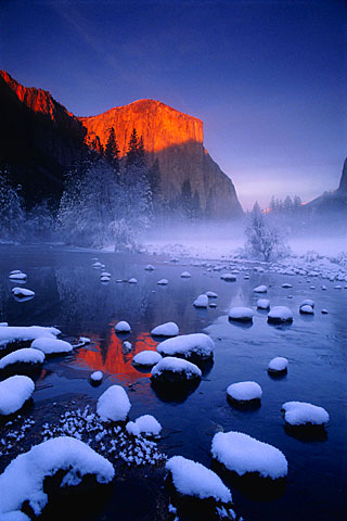
Galen Rowell was an american landscape photographer who's work i absolutely adore due to the colours he manages to use and capture that almost look unnatural, but so beautiful.

A snowy lake scene. I love how the use of contrasting colours here.  The sun hitting the mountain in the background creating a gorgeous bright orange which can also be seen reflected in the water. Against the strong blue of the sky and the water.
I love how the mountains in the foreground are quite dark but in the background, the most amazing gold mountains can be seen peeking out. almost glowing. Brightly outlining the dark mountains in front of them. I love how even further in the foreground, the back is a very bright mix of colours; blue, yellow, white and green. The dark mountain sandwiched between brightness. The grass growing out the water at the front of the frame is noticeably green, almost looks like a green shadow rippling in the water for the silhouetted mountains. You almost have to look twice.
Again the colours here are absolutely phenomenal. The contrast between the orange and the blues again. The photograph is so crisp, and the water so still that the reflection of the mountain in the water almost doesn't look like a reflection, but a continuation of the mouton itself.

Exercise: A Narrative Picture Essay

For this exercise, i had to tell a story using photographs. I decided to use the method of baking a cake as my story.
I love to bake and so this was very familiar to me and so i could focus more on taking the photographs than the process of baking a cake itself. I am familiar with a lot of cook books, and how pictures are represented in these. I was already aware of what i personally find visually attractive in a cook book and had a basic idea of how i would set one out if creating one myself.
To tell my story, i took a photograph of each step i took creating a cake, starting with the ingredients and ending with the finished product. Some photographs i took out as i felt they were not important or visually just didn't look that great. I wanted the steps to be obvious, but i didn't want too many pictures so it was overwhelming. I wanted some simple, crisp, easy to understand and quite modern looking.
I kept my photographs in chronological order, to show method and to be easily understandable to the reader, so much so that very little text would be necessary to understand how to make the cake.
To get it looking very neat and simple, i tried to keep my photographs together in  neat, very clear square formation. I tried to keep all the photographs the same size, as no step is more important than the other, and to be the simplicity of this visually pleasing. I made the one photograph, of the egg shells, bigger than the rest. I did this just to break it up a bit, and to me it makes it look just that bit better. I chose this photograph over the others, as i found it more attractive, and more abstract. I feel it works well. It also breaks up the colour in what would other wise be a collection of very beige photographs. 
My vision for this in print would be; these photographs on one page, and on the adjacent page, the recipe. Very simple, very neat, very crisp, very easy to understand and hopefully very visually pleasing.
From left to right
1. Ingredients
2. Creaming the butter
3. Creamed butter mixed with sugar
4. Empty egg shells
5. Cake batter
6. Batter ready for the oven
7. Whipping cream for the filling
8. The finished product.